
Week 1 At Metis Bootcamp - EDA on the MTA, Crazy Turnstiles, & Perfectionism
My first week at Metis Bootcamp has flown by, and so far the biggest challenge has been getting this blog set up (just kidding, but it definitely took me much longer than it should have). This week’s focus was getting up to speed on several of Python’s linchpin data manipulation and analysis packages like numpy, pandas, and matplotlib, with our workflow anchored by a project on MTA subway traffic data. The goal of the project was to help a hypothetical non-profit promoting women in Tech come up with a strategy for canvasing at NYC subway stations. We were given broad leeway to set assumptions about what to look for in a station and who we wanted to target, and could incorporate any data we thought would be useful in addition to the MTA’s official turnstile traffic data. Like many other teams, mine decided to cross reference the traffic data with neighborhood wealth data to aim for stations with high potential for both raising general awareness and finding valuable donors.
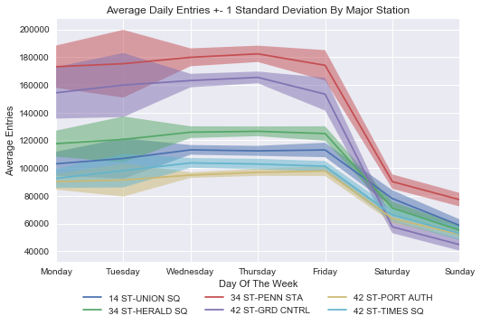
“Exploratory Data Analysis” (EDA) is a catch-all description of this project’s process, meaning pretty much any studying and visualization of a dataset in order to extract meaning from it up until the the point of doing extensive statistical modeling and/or hypothesis testing. As an example of an end result, the chart above summarizes traffic trends by day of the week for the most frequented subway stations. The shading above and below each line shows the variance in daily station traffic, highlighting the fact that traffic trends are more reliable in the middle of the work week than at its start or end (this makes sense given holiday long weekends, variability in weekend travel plans, etc.)
Coming up with visualizations that tell a clear story about the data is one of the most enjoyable parts of EDA - these visualizations represent both the finished package of the information you’ve scraped together and your creative spin on how to frame that information. But before getting there, you usually have to spend some time battling the data to get it into a usable format with meaningful information. Here’s a neat visual guide of how it’s done:

Just imagine that the cat is doing a bunch of pandas groupby operations and screening out nonsensical data in a frenzy. True fact, this is what the cat is writing:
df_MTA_byDate = df_MTA.groupby(['C/A','UNIT','SCP','STATION','DATE','DAY_OF_WEEK']) \
                .ENTRIES.agg({'MIN_ENTRIES':'min'})
df_MTA_byDate = df_MTA_byDate.reset_index()

df_MTA_byDate['DAILY_ENTRIES'] = df_MTA_byDate.groupby(['C/A','UNIT','SCP','STATION']) \
                                 .MIN_ENTRIES.diff().shift(-1)

df_MTA_byDate.drop('MIN_ENTRIES',axis=1,inplace=True)
df_MTA_byDate.loc[df_MTA_byDate['DAILY_ENTRIES'] < 0, 'DAILY_ENTRIES'] = np.nan
df_MTA_byDate.loc[df_MTA_byDate['DAILY_ENTRIES'] > 100000, 'DAILY_ENTRIES'] = np.nan
The idea here is to convert the raw turnstile entry data, which are cumulative counts, into daily entry values that will actually be useful for analysis. You can do this by taking the difference between cumulative entries at the start of the next day and cumulative entries at the start of the current day. But of course the data is not your friend, so sometimes the cumulative counts randomly reset or jump forward by hundreds of thousands. Either the MTA has found a way to demolish the space-time continuum (plausible, would explain the wait times and the current “state of emergency”), or the data… isn’t quite accurate. So you want to NA out data points that are clearly invalid, and it takes some time to identify exactly all the ways that things can go wrong and figure out what cutoffs you should use.
People in my cohort have referred to these cases as “crazy turnstiles”, and have pointed out that you could do an entire analysis just on how often turnstiles are crazy, in what way they tend to be crazy, and whether the same turnstiles tend to be consistently crazy. That would be funny, but there’s a broader point here that’s really important. How well you actually understand your data is basically a function of how well you understand what’s wrong with your data, and you realize this the hard way when you assume everything is okay and end up with negative daily turnstile entry numbers. Going forward, I think the right approach to take is to actively try to break the data and profile its most glaring issues, starting from the hypothesis that the data is nonsense until proven sensible.
As a final reflection on what I’ve learned this week, I want to turn to a central problem in working life that’s often overlooked in the context of a classroom. When they introduced the MTA project at the beginning of the week, our instructors gave us a pointed warning that our deadlines at bootcamp will be unfair and that we need to abandon perfectionism. There’s always another step to take to try to make the data more polished, to expand the scope of your project and analysis, or to adjust your model for even slightly better accuracy. Yet in the real world time is the most important resource and knowing when to constrain yourself is often more valuable than the quality of your ideas.
I definitely need to take this to heart more. There were a couple of instances during the MTA project when I went down the rabbit hole. I spent a few hours pulling geospatial twitter data on #womenintech to see if we could use it to find interest hotspots near certain subway stops - there was nowhere near enough data for this to be feasible (I found ~6 geotagged tweets, none of them even in New York State!), which I should have been able to realize before I dug into it. I also got bogged down trying to solve a tricky deduplication problem on different stations with the same name in the dataset - these would need to be deduped on station-linename combinations that were not unique in the raw data because of inconsistent formatting. I worked on writing a method to collapse disparate linenames to unique values using string similarity measures, but I ultimately had to abandon this attempt to work on finalizing our main analysis and presentation. The key here is having the right priorities and not getting overconfident. It’s obviously hard to forecast exactly how long a problem might take you and whether you can solve it well, but be a good Bayesian about it and realize you’re probably overrating your skill and efficiency relative to a reasonable outside view expectation of the problem’s tractability. In un-jargoned terms, be humble.
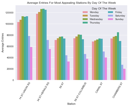
Ending on a more colorful note, here’s a chart that will answer all the questions you definitely had about daily traffic distributions among subway stations at the cross section of highest volume and best wealth characteristics. This tells you that if you want to canvas on a weekend you should go to Union Square, which seems to actually have the second highest weekend volume of any NYC subway station!
If you’re interested in seeing the code for the analysis, check out this repo.